Target keyword: best stencil fonts
Post URL slug: /best-stencil-fonts-branding-logos-packaging
Author: Pedro Teixeira Foundry
Introduction
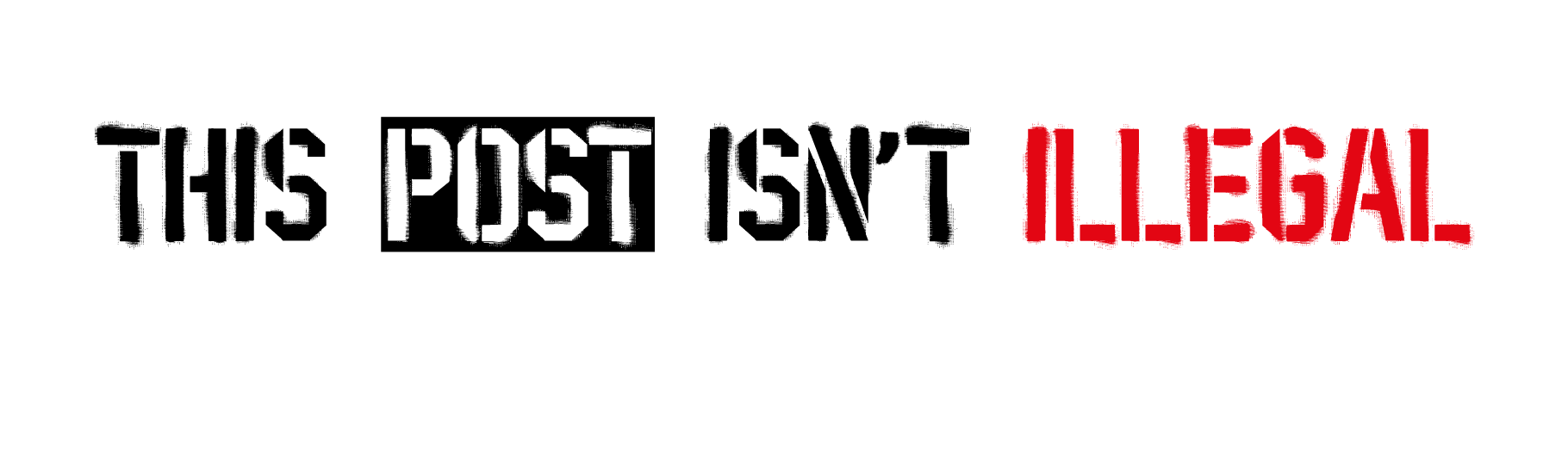
Pick up a can of spray paint, hold a cardboard template against a wall, and press – the result is one of the most instantly recognisable visuals in design history. Stencil lettering has been everywhere: freight crates, army surplus, protest art, punk posters, and now some of the most recognisable streetwear labels in the world.
The problem is that most stencil fonts fall into one of two traps. Either they look too clean – technically a stencil but with none of the texture that makes the style feel real – or they’re image-based PNG or SVG overlays that are impossible to edit, recolour, or actually use in a type workflow.
This guide covers the best stencil fonts worth your time in 2026, how to evaluate them honestly, and what to look for depending on whether you’re designing a logo, a product label, a t-shirt graphic, or an event poster. We’ll also make the case for a specific font that we think solves a problem most stencil fonts ignore.
What Are Stencil Fonts?
A stencil font mimics the visual result of using a physical stencil – a cutout template held against a surface and filled with ink or spray paint. The defining feature is the bridge: small connecting sections within each letterform that hold the stencil together so enclosed areas (like the inside of an O or the counter of a B) don’t fall out.
In digital type, those bridges became a stylistic signature rather than a structural necessity. Over time, stencil fonts split into two broad camps:
- Clean stencil fonts – structured letterforms with sharp cuts and bridges, but smooth outlines. Strong on legibility, minimal on texture.
- Textured stencil fonts – letters with spray-paint bleed, rough edges, and surface imperfection baked into the glyphs. More visceral, more street, harder to find done well as an actual font.
The distinction matters because they solve different creative problems. Clean stencils work well for precision-driven branding – military, industrial, logistical. Textured stencils are the choice when you need something that looks like it was made on a wall, not on a grid.
What to Look For in a Stencil Font
Before you commit to a font, run it against these criteria:
1. Authenticity of texture
Does the distressing look like it was designed, or discovered? Real spray-paint bleed is irregular – it bleeds more at certain angles, catches on rough surfaces, pools slightly at the edge of the stencil. Generic texture overlays look artificial precisely because they’re applied uniformly.
2. Editability
An actual font file (OTF, TTF) lets you type, recolour, resize, and animate without destructive steps. Stencil-effect PNGs and SVG image graphics look similar but are dead ends the moment a client asks you to change the colour or drop it into their CMS.
3. Software compatibility
Not every designer is running the latest Creative Cloud. Some of your clients are working in older versions of Word, PowerPoint, or Canva. A font that installs like any other font and just works everywhere is worth more than one that requires a specific renderer.
4. Two styles for two contexts
The best stencil typefaces include a textured (Sprayed) version for high-impact display work and a clean version for situations where legibility or reproduction matters more – think packaging small print, internal brand guidelines, or digital product UI.
5. Glyph coverage
If you’re designing for European brands or multilingual packaging, you need extended Latin support. Check before you buy.
6. Commercial licensing clarity
Logos, packaging, t-shirts, web, app – these all require different licence terms. A font without clear terms is a liability you don’t want to discover mid-client project.
The Best Stencil Fonts: Top Picks
🥇 1. Stencil PTX – Pedro Teixeira Foundry (Best Overall)
This is the one that solves the problem most stencil fonts either ignore or fake.
Stencil PTX was designed by Pedro Teixeira with a specific technical goal: capture authentic spray-paint texture inside the font file itself, without relying on SVG font technology, image overlays, or any technique that compromises editability. The result is an OTF/TTF font that installs and behaves like any other font – in Illustrator, InDesign, Photoshop, Figma, and yes, even an old copy of Microsoft Word – but produces letters that genuinely look like they were cut through a physical stencil and sprayed onto a wall.
The texture lives at the edges of each letterform. The spray-paint bleed, the microscopic roughness where paint catches and pools – it’s built into the glyph outlines. On a white background, the letters don’t look digitally generated. They look found.
The family ships in two styles:
- Sprayed – the full textured experience. Every glyph carries the spray-paint irregularity. Right for streetwear graphics, gig posters, packaging that needs an urban edge, album art, campaign headlines, and any context where you want the type to feel like it came off a real wall.
- Clean – same stencil skeleton, sharp and precise. The bridge positions and structural DNA are identical, making it easy to layer or switch between the two styles without redesigning your layout. Right for brand systems, logotype variations, editorial spreads, and anything that needs the stencil personality with tighter production standards.
What makes it technically different:
Most “textured” stencil fonts use one of three approaches: bitmap textures embedded in the file (heavy, low-res at large sizes), colour font technology that requires SVG support (breaks in older software), or simply – a clean font packaged with a separate texture overlay that the designer has to apply manually. Stencil PTX uses none of these. The texture is in the vector outlines of each glyph, making it resolution-independent, fully recolourable, and universally compatible.
Glyph set: 220+ glyphs with extended Latin support.
Formats: OTF and TTF (desktop and web-compatible).
Price: from $20.
Best for: Streetwear branding, packaging, t-shirt graphics, campaign headlines, event posters, album covers.
Try it before you buy it – Download the free Stencil PTX demo →
🥈 2. Stardos Stencil – Google Fonts (Best Free Option)
Available on: Google Fonts (free)
Stardos Stencil is one of the most widely used free stencil fonts because it’s clean, well-constructed, and genuinely reliable for display use. The letterforms are confident, the bridges are well-placed, and it scales well from small sizes to large headlines.
The honest take: Stardos is a solid free choice, especially for body-stencil use cases or when budget is the primary constraint. But it’s clean by design – there’s no texture, no spray-paint quality, nothing that feels off the wall. For branding work that needs raw authenticity or a real street feel, it reads as digital-first. It’s also everywhere at this point, which means it lacks distinction.
Best for: Wayfinding, digital UI with a stencil feel, quick headlines when budget is tight.
Not for: Any project where the authentic, hand-made quality of the stencil aesthetic is the whole point.
🥉 3. Stencil Std – Adobe Fonts / Classic Reference
Available on: Adobe Fonts (included with Creative Cloud)
The original. Gerry Powell designed Stencil Std in 1937, and it remains the typographic reference most people are picturing when they say “stencil font.” It’s conservative, legible, and historically grounded – the visual language of mid-century military and industrial America.
The honest take: Stencil Std does exactly what it was designed to do, and has been doing it since 1937. The problem is that 88 years of ubiquity makes it a shorthand rather than a choice. It signals “stencil” immediately – but it also signals “generic.” If your client’s brand needs to feel like a shipping crate, it’s perfect. If they want to feel like a brand, it probably isn’t.
Best for: Military-adjacent brands, tactical gear, industrial packaging, contexts where the traditional stencil visual code is the right signal.
Not for: Streetwear, modern branding, or anything where distinctiveness is part of the brief.
Use Cases: Which Stencil Font Works Where
| Use case | Recommended choice | Why |
|---|---|---|
| Streetwear brand logo | Stencil PTX (Sprayed) | Authentic texture, editable, brand-worthy |
| T-shirt graphic (individual/freelance) | Stencil PTX (Sprayed) | Works in any software, print-ready |
| Product packaging (agency brief) | Stencil PTX (Clean or Sprayed) | Two styles, clear licensing, extended Latin |
| Event poster / gig flyer | Stencil PTX (Sprayed) | Raw texture at large sizes looks real |
| Album cover / music art | Stencil PTX (Sprayed) | Street-culture credibility without PNG hassle |
| Digital UI with stencil styling | Stardos Stencil | Free, clean, web-ready via Google Fonts |
| Military / industrial brand reference | Stencil Std | Classic code, immediately recognised |
| Brand system needing both display + clean | Stencil PTX (both styles) | Same family, consistent skeleton across uses |
How to Choose the Right Stencil Font for Your Project
Run through these three questions before you settle on a font:
1. What’s the emotional register?
Military/industrial → clean, structural, high bridges. Street/urban/graffiti → textured, rough edges, authentic imperfection. Somewhere between → a clean stencil paired with deliberate layout choices.
2. Where will it live, and who’s handling the files?
If you’re a designer handing files to a client who uses Word, Canva, or an older version of Photoshop, you need a font that installs and behaves normally. PNG and SVG graphic solutions break outside the app they were created in. An OTF/TTF file works everywhere.
3. Do you need both a textured and a clean version?
Brand systems almost always benefit from this. The textured style carries impact in campaign headers, social assets, and merchandise. The clean style handles body copy adjacents, watermarks, address blocks, and sub-brand applications where full distressing would be illegible or inappropriate.
If the answer to (3) is yes, Stencil PTX is the only font in this roundup that gives you both in a single family, with matching skeleton and spacing.
Pairing Stencil PTX with Supporting Typefaces
Stencil PTX works with contrast. Because the Sprayed style carries significant visual weight and character, the supporting font should do the opposite – clean, neutral, functional.
Recommended pairings:
- Inter or Helvetica Neue – neutral grotesque for body copy and labels. The contrast with the distressed stencil headline is sharp and deliberate.
- Alteix Sans (Pedro Teixeira Foundry) – if you want typographic consistency within one foundry’s aesthetic language, the Alteix Sans family (8 weights) pairs well with Stencil PTX and gives you a workhorse for everything below the headline.
- Roboto Mono – for a more technical/functional feel alongside the street-art energy of Stencil PTX. Good for brands that sit between industrial and urban.
Avoid pairing Stencil PTX with other heavily textured or decorative fonts. One dominant personality per design.
FAQ: Best Stencil Fonts
What is the most realistic spray-paint stencil font?
Stencil PTX (Sprayed) is the most technically authentic option we know of – the texture is built into the vector outlines of each glyph, not applied via overlay or image format. The result is letters that genuinely look like spray paint on a screen or in print.
Can I use a stencil font in Microsoft Word?
Yes – if it’s an OTF or TTF file. Stencil PTX ships in both formats and installs like any other font. You can type with it in Word, PowerPoint, Google Docs, or any software that uses system fonts. Image-based stencil “fonts” (PNG/SVG packs) do not work this way.
Are stencil fonts good for logos?
Absolutely – when chosen deliberately. Stencil PTX was designed with logo and branding use in mind. The Clean style is particularly well-suited to logotypes: legible, distinctive, production-friendly.
What’s the difference between a clean and a sprayed stencil font?
A clean stencil font has the characteristic bridges and gaps of physical stencil lettering but smooth, precise outlines – no texture. A sprayed version adds the roughness of actual spray paint at the letter edges. Stencil PTX gives you both in one family.
How do I licence a stencil font for packaging and merchandise?
You need a commercial desktop licence at minimum. For packaging with wide distribution or merchandise sold at volume, check whether the licence covers logo use and print-on-demand. Pedro Teixeira Foundry offers clear commercial terms directly on the product page.
Final Thoughts
The stencil style hasn’t aged because it’s a trend – it’s aged because it carries a visual vocabulary that still means something. Raw, direct, hand-made, confrontational. Used well, it tells a story about a brand or a piece of work that cleaner typefaces can’t.
The gap in the market has always been the same: get me a stencil font that looks real and works like a normal font. One that a freelancer can hand off to a client without a workflow explainer. One that doesn’t break when the agency opens it in a different version of Illustrator.
Stencil PTX is the answer to that specific problem. And if you’re not ready to commit, the demo is free.
→ Download the free Stencil PTX demo
→ Browse all Pedro Teixeira Foundry stencil fonts
Published by Pedro Teixeira Foundry – original display fonts for designers who mean it.