
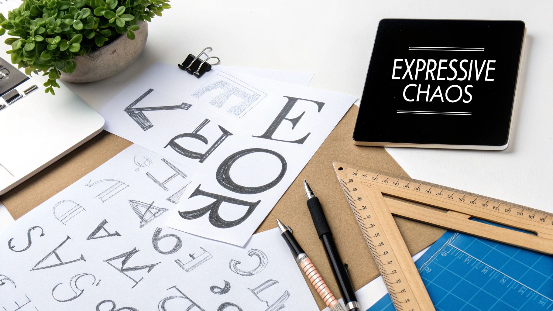
A stencil font is more than just a typeface; it’s a design statement rooted in utility and industrial aesthetics. Characterized by its distinctive breaks or “bridges” in the letterforms, this style mimics the look of physical stencils used for everything from street art to military crates. Today, the stencil font has evolved from a purely functional tool into a powerful choice for branding and graphic design, offering a blend of raw, urban energy and clean, modern precision. This guide will explore the best stencil fonts available, how to use them effectively, and what makes this typography style a trending choice for 2025.
A Brief History of Stencil Lettering
The core concept of stencil lettering is centuries old, but the stencil font as we know it gained prominence through military and industrial applications. The gaps in the letters were a practical necessity, allowing a single piece of material (like metal or cardboard) to form a complete character without falling apart. This utilitarian origin gives the typeface an inherent sense of authenticity and ruggedness.
From military equipment and shipping containers, the style was co-opted by street artists and activists, who used its quick, replicable nature for guerrilla messaging. This connection to urban art infused the stencil font with a rebellious, counter-cultural edge. Today, designers leverage this rich history to evoke feelings of industrial chic, bold activism, or minimalist efficiency.
Key Features to Look for in a Stencil Font
Not all stencil fonts are created equal. When choosing a typeface for your project, look beyond the basic aesthetic and consider these critical features that separate a professional font from a generic one.
- Thoughtful Stencil Breaks (Bridges): The defining feature of a stencil font is its breaks. A well-designed typeface has bridges that feel intentional and integrated into the letter’s structure, not just randomly placed gaps. They should enhance the letterform's rhythm without compromising legibility too much.
- Multiple Weights and Styles: A versatile stencil font family will offer various weights (e.g., Light, Regular, Bold) and styles (e.g., Condensed, Italic). This allows you to create a cohesive typographic hierarchy without needing to introduce other fonts.
- OpenType Alternates: Professional fonts often include alternate characters, ligatures, or stylistic sets. These OpenType alternates give you creative flexibility, allowing you to swap out a standard character for a more stylized version to add unique flair to logos and headlines.
- Multilingual Glyph Support: If your project needs to reach a global audience, ensure the font includes a comprehensive set of glyphs, including accented characters and different currency symbols.
- Clean and Consistent Kerning: Despite its often-rugged appearance, a quality stencil font should have well-balanced spacing. Proper kerning ensures the letters sit together naturally, which is crucial for readability in headlines and short blocks of text.
Our Top 5 Stencil Fonts for 2025
Here are our top picks for the best stencil fonts that blend style, functionality, and professional features. Each offers a unique take on the stencil aesthetic, making them suitable for a wide range of design projects.
1. Stencil PTx
Description: Stencil PTx is a modern and robust display font that balances industrial strength with refined design. Its clean lines and consistent breaks make it highly legible, while its comprehensive family of weights provides incredible versatility.
- Ideal Use Cases: Branding for tech startups, athletic apparel, packaging, and bold editorial headlines.
- Pros: Extensive weight range, excellent legibility for a stencil style, and a clean, contemporary feel.
- Cons: Its clean look may not be suitable for projects requiring a more grungy, distressed aesthetic.
- Check out our Stencil PTx font family
2. Emerge
Description: Emerge is a minimalist stencil font with a geometric foundation. Its unique, stylized breaks create a futuristic and sophisticated look, making it a standout choice for high-end brands.
- Ideal Use Cases: Fashion branding, logotypes, tech websites, and minimalist poster design.
- Pros: Highly stylized and unique, perfect for making a memorable statement.
- Cons: Its distinctive style may be too expressive for body text or more conservative applications.
3. Depot
Description: Depot leans into the classic, utilitarian roots of stencil lettering. With its blocky, no-nonsense letterforms, this typeface is perfect for projects that need to communicate durability and reliability.
- Ideal Use Cases: Hardware brands, outdoor gear companies, coffee shops, and any design needing a vintage industrial touch.
- Pros: Authentic and rugged feel, highly effective for themed branding.
- Cons: Can feel heavy-handed if not paired with lighter design elements.
4. Mindset
Description: Mindset offers a softer, more rounded take on the stencil font. Its friendly curves and clean breaks give it an approachable yet modern vibe, setting it apart from more aggressive stencil designs.
- Ideal Use Cases: Lifestyle brands, creative agency portfolios, and social media graphics.
- Pros: Approachable and modern, versatile across digital and print media.
- Cons: May lack the hard-hitting impact needed for certain industrial or urban design fonts.
5. Division
Description: Inspired by military and aviation lettering, Division is a sharp, commanding stencil font. Its precise angles and wide stance give it an authoritative presence, perfect for impactful headlines.
- Ideal Use Cases: Video game titles, automotive branding, event posters, and athletic promotions.
- Pros: Strong, authoritative presence; excellent for creating high-impact visuals.
- Cons: Limited versatility; works best for headlines rather than smaller text.
How to Use Stencil Fonts in Your Designs
Using a stencil font effectively is about balance. Its strong personality can easily overwhelm a design if not handled with care. Here are some actionable tips for integrating this powerful typography style into your work.

Pairing with Other Fonts
A stencil font is almost always a display font, meaning it's meant for headlines, not paragraphs. The key is to pair it with a simple, legible font for body copy.
- Clean Sans-Serifs: This is the safest and most effective pairing. Fonts like Helvetica, Open Sans, or Roboto provide a neutral, readable foundation that allows the stencil font to shine without creating visual conflict. Explore our collection of sans-serif fonts for great pairing options.
- Slab Serifs: For a bolder, more industrial look, a slab serif can complement a stencil font’s blocky nature. Just ensure the slab serif is simple enough not to compete for attention.
- What to Avoid: Avoid pairing a stencil font with another highly decorative font (like a script or blackletter). This creates visual clutter and makes the design difficult to read.
Spacing, Color, and Effects
- Give It Room: Stencil fonts have a lot of internal texture due to their breaks. Give your headlines ample letter spacing (tracking) and line height (leading) to prevent them from feeling cramped. Generous white space around the text is also crucial.
- Bold Color Choices: Stencil fonts work well with strong, high-contrast color palettes. Think monochrome (black and white), bold primary colors, or earthy tones for an industrial feel.
- Add Texture: To enhance the authentic stencil look, consider adding subtle textures. A gritty overlay or a slight spray effect font texture can amplify its urban or industrial vibe. For a deeper dive into branding with these fonts, check out our guide on how to create a brand guideline.
Technical Advice & Licensing
Before you download and use a stencil font, it’s important to understand the technical and legal aspects.
- File Formats (OTF vs. TTF): OpenType Font (OTF) is generally the preferred format for graphic design. It’s a more modern format that can support advanced features like OpenType alternates, ligatures, and stylistic sets. TrueType Font (TTF) is an older format but is universally compatible. If the font offers both, choose OTF.
- Web Embedding: If you plan to use the font on a website, you’ll need web font files (like WOFF or WOFF2) and the appropriate license. Most font foundries offer a specific web license that allows you to embed the font using
@font-facein your CSS. Always check the licensing terms. - Licensing Considerations: A font is a piece of software, and you are purchasing a license to use it. Be sure to read the End User License Agreement (EULA). Common license types include:
- Desktop License: For use in print documents, logos, and static images.
- Web License: For embedding on a website.
- App/eBook License: For embedding in a mobile app or digital publication.
- Server License: For services where users can create customized products using the font.
FAQ: Using Stencil Fonts
Here are answers to some frequently asked questions about working with the stencil font style.
Is a stencil font good for logos?
Absolutely. The unique and memorable nature of a stencil font makes it an excellent choice for logotypes, especially for brands in the industrial, tech, fitness, or fashion sectors. Its distinct character helps a brand stand out.
Can I embed a stencil font on my website?
Yes, provided you have the correct license. When you purchase a font, make sure to get a web license, which will provide you with the necessary WOFF/WOFF2 files and the legal permission to use it online.
Does a stencil font support accented characters?
This depends on the quality of the font. Professional, premium stencil fonts will typically offer robust multilingual support, including a wide range of accented characters and glyphs. Always check the font’s character map or specimen sheet before buying.
How can I make a stencil font look more authentic?
To enhance the authentic spray effect font look, you can apply subtle textures or grunge overlays in your design software. Experiment with slightly misaligned placements or pair it with other urban design elements like graffiti splatters or rough backgrounds.
Final Thoughts: Make a Bold Statement
The stencil font has successfully transitioned from a utilitarian tool to a sophisticated design choice. Its ability to convey strength, authenticity, and an edgy, modern vibe makes it a versatile asset for any designer’s toolkit. Whether you’re building a brand from scratch or looking to inject some personality into a project, the right stencil font can make a powerful and lasting impression.
Ready to find the perfect typeface for your next project? Explore our full library of modern and expressive fonts to discover unique designs that will elevate your work.
Explore Our Full Font Collection Now
Article created using Outrank
Thank you for the auspicious writeup It in fact was a amusement account it Look advanced to more added agreeable from you By the way how could we communicate