
So, what exactly is a stencil font? At its core, a stencil font is a typeface designed to look as though its letters were created with a physical stencil. This is achieved through distinctive “breaks” or gaps in the letters, which in the real world would be the bridges holding the stencil together. This unique characteristic gives the stencil typeface its utilitarian, industrial, and often edgy aesthetic.
The Soul of Stencil Typography
Where other fonts might prioritize seamless elegance, a stencil font is all about raw, impactful character. It injects a sense of authenticity and power into a design, making it a go-to for designers wanting to set a specific mood—be it militaristic, urban, or industrial. This unique lettering style has seen a huge surge in popularity, trending in everything from modern branding to poster design.
Their identity comes down to a few core traits:
- Stencil Breaks: The defining feature is the small gaps that segment the letterforms.
- Bold and Geometric Forms: Many stencil fonts have strong, clear shapes, often with a blocky or angular feel.
- Utilitarian Vibe: They often evoke a sense of practicality, referencing military crates, street art, and industrial signage.
This unique combination of form and function makes stencil fonts a powerful tool in modern graphic design.
Key Characteristics of the Best Stencil Fonts at a Glance
This table summarizes the defining features of a stencil font, helping you quickly grasp its core attributes and typical applications in design.
| Characteristic | Description | Common Use Cases |
|---|---|---|
| Stencil Gaps/Breaks | Letters are segmented with breaks, mimicking the look of physical stencils. | Military-themed designs, urban design fonts, industrial branding, packaging. |
| Strong Visual Impact | The bold, often geometric, structure makes text stand out, perfect for headlines and logos. | Posters, apparel design, album art, brand taglines, spray effect font graphics. |
| Functional Aesthetic | The style feels practical, authentic, and grounded, adding a raw edge to designs. | Coffee shops, craft breweries, construction companies, streetwear brands. |
| Open Type Alternates | The best stencil fonts include alternate characters (alternates) for stylistic variation and customization. | Logo design, creative headlines, social media graphics needing a unique touch. |
| Emphasis over Readability | Designed for high visual impact in short text blocks rather than long paragraphs of body copy. | Brand taglines, titles, single-word statements on apparel, quotes. |
Ultimately, this table shows that the stencil font is a specialist. It is chosen for its ability to convey a strong, specific feeling, not just to present information.
A great stencil font doesn’t just spell out words; it communicates an attitude. It can make a brand feel more rugged, a poster more urgent, or a logo completely unforgettable.
Once you grasp this, you start using them more effectively. You’re not just picking out letters; you’re choosing an entire aesthetic. It’s what makes a stencil typeface such a high-impact tool. To see how they stack up against other stylized typefaces, explore our collection of display fonts.
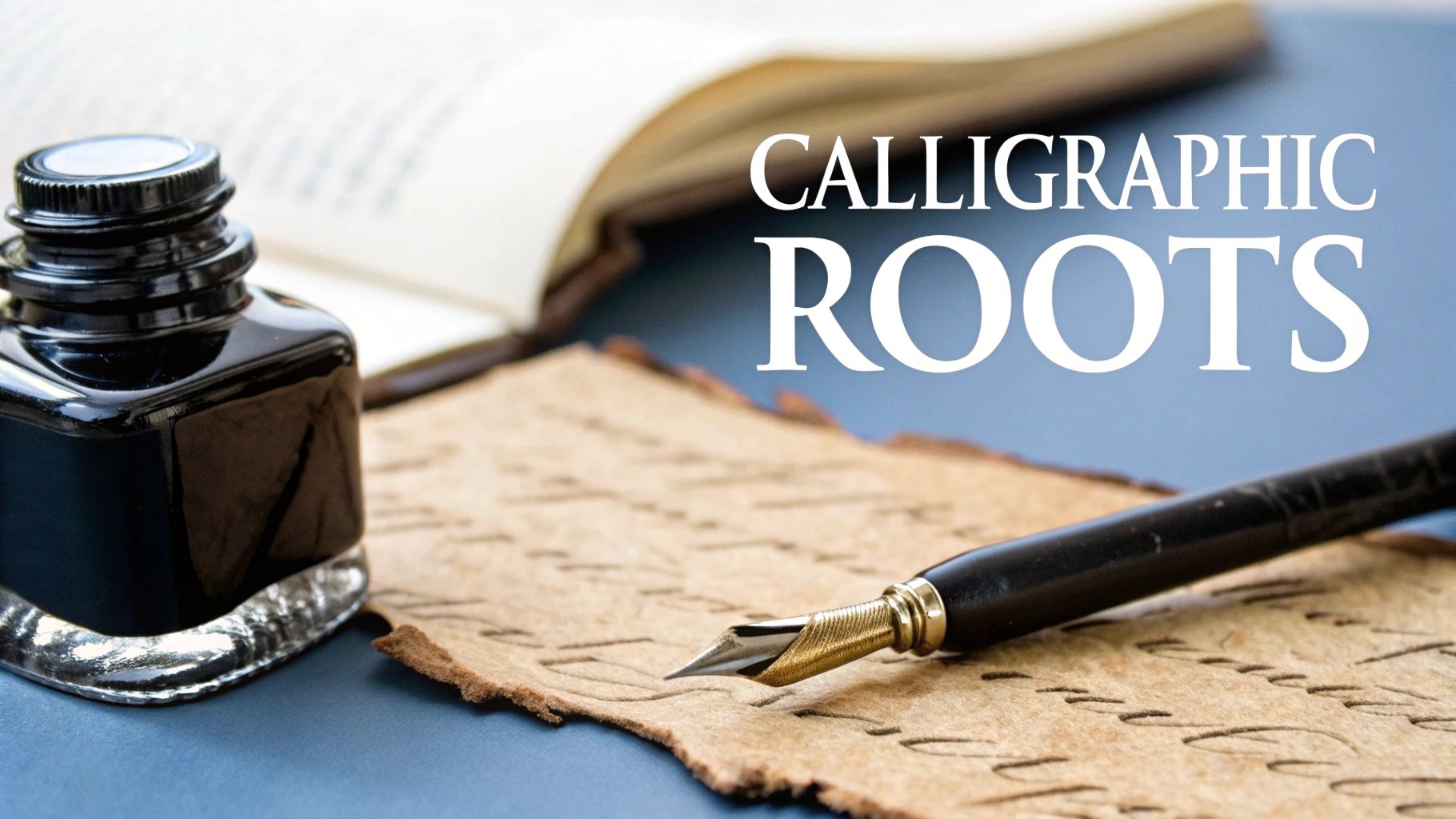
A Brief History of the Stencil Font
To really get what the stencil font is all about, you have to look at its practical, hardworking roots. Long before digital typography, stenciling was a purely functional method for reproducing letters and shapes quickly and consistently.
Picture Roman engineers marking legionary equipment or manufacturers in the 19th-century branding shipping crates with bold, clear lettering. This utilitarian history is baked right into the DNA of every modern stencil font.
The leap from physical tool to digital typeface was a natural one. Type designers saw the raw aesthetic power in these functional letterforms. They had the challenge of capturing that rugged, disconnected spirit and bottling it into a cohesive font family, preserving the personality and industrial feel.
From Function to Form
The evolution into the stencil fonts we use today accelerated in the 20th century. The military adopted stenciling for its uniformity and legibility, solidifying its association with authority and order. Later, street artists co-opted the technique, using stencils and spray paint to create powerful, fast, and repeatable urban art.
This heritage is exactly why stencil fonts feel so authentic. They aren’t just a collection of characters; they’re entire systems designed to capture a history of utility and rebellion.
Each break and geometric curve in a stencil font is a nod to centuries of practical application. Understanding this gives you a better eye for selecting a typeface with a genuine story behind it.
Why This History Matters for Designers
Knowing where a stencil font comes from helps you pick the right one. A font inspired by military stencils will bring a disciplined, rugged feel. On the other hand, a font with a rougher, spray effect font aesthetic feels rebellious and urban.
This context is everything. It allows you to make smart design choices that match the font’s historical mood with your project’s goals. This connection is a core principle in good design, and you can dive deeper into it with our guide to fundamental typography concepts.
Ultimately, when you appreciate their history, you can use a stencil font as more than just decoration. You can use it as a powerful storytelling tool.
Top 5 Best Stencil Fonts for 2025
Choosing the right stencil font can elevate your design from good to unforgettable. We’ve curated a list of the top 5 stencil fonts that offer versatility, style, and professional-grade features. Each of these premium stencil font options has a unique personality perfect for a range of projects.
1. Stencil PTx Pro
Description: A modern workhorse, Stencil PTx Pro combines classic stencil functionality with clean, contemporary geometry. It’s highly legible and comes with multiple weights and Open Type alternates, making it incredibly versatile.
Ideal Use Cases: Branding for tech startups, athletic apparel, modern packaging, and UX/UI headlines.
Pros & Cons:
- Pro: Excellent legibility and a wide range of weights.
- Con: Its clean look may be too polished for projects needing a more distressed or grunge feel.
Check out Stencil PTx Pro
2. Urban Rebel
Description: Inspired by street art and urban design fonts, Urban Rebel features a rough, spray effect font texture. It’s bold, energetic, and perfect for making a statement.
Ideal Use Cases: Music festival posters, skateboard branding, apparel graphics, and social media campaigns for edgy brands.
Pros & Cons:
- Pro: Authentic, high-energy aesthetic.
- Con: The distressed texture can reduce legibility at very small sizes.
3. Depot
Description: Depot is a classic industrial stencil font. Its heavy, blocky letterforms are reminiscent of old shipping crates and warehouse signage, giving it a powerful, masculine feel.
Ideal Use Cases: Branding for breweries, construction companies, and men’s grooming products.
Pros & Cons:
- Pro: Strong, authoritative presence.
- Con: Limited versatility; best suited for a specifically industrial or vintage vibe.
4. Portico Stencil
Description: Portico offers a more refined and elegant take on the stencil typeface. With clean lines and subtle gaps, it feels sophisticated and modern, bridging the gap between utilitarian and high-end design.
Ideal Use Cases: Fashion magazines, architectural firm logos, luxury product packaging, and cafe branding.
Pros & Cons:
- Pro: Unique, elegant aesthetic that stands out from typical stencil fonts.
- Con: May not be bold enough for projects requiring a heavy, impactful look.
5. Mindset
Description: Mindset is a rounded stencil font that feels friendly and approachable. Its softer edges make it a great alternative to the harsh angles of traditional stencil lettering, giving it a futuristic yet playful vibe.
Ideal Use Cases: Tech branding, children’s products, modern signage, and poster design.
Pros & Cons:
- Pro: Friendly and modern, offering a unique take on the stencil style.
- Con: The rounded style might not fit serious or corporate branding.
How to Use Stencil Fonts in Your Designs
A stencil font is a powerful tool, but using it effectively requires a bit of finesse. The key is to leverage its strengths—boldness and character—without overwhelming your design. Here’s how to do it right.
The number one rule? Hierarchy. A stencil font is born to be a star. Use it for headlines, logos, and short, impactful phrases. Never use it for body text, as the stencil breaks make long paragraphs nearly impossible to read comfortably.
The Art of Font Pairing
Pairing is crucial for a balanced design. The secret is contrast. Since a stencil font is inherently decorative and loud, it needs a simple, clean partner that acts as a stable foundation.
- With a Sans-Serif: This is the classic, can’t-go-wrong combination. Pair a bold stencil font with a neutral, geometric sans-serif like Montserrat or Lato. The clean structure of the sans-serif lets the stencil typeface be the hero without creating visual noise.
- With a Slab Serif: For a robust, industrial look, pair your stencil font with a slab serif. The blocky serifs complement the strong forms of the stencil, creating a cohesive and powerful aesthetic.
A common mistake is pairing two different decorative fonts, like a stencil and a script. This almost always results in a chaotic, illegible design. Let your stencil font take the lead.
Spacing, Color, and Effects
Beyond pairing, the details make the difference.
- Tracking: Pay attention to the letter-spacing (tracking). Giving a stencil font a little extra space can enhance its legibility and give it room to breathe, reinforcing its clean, architectural feel.
- Color: Bold, high-contrast colors work best. Think black on yellow for an industrial warning sign vibe, or white on a dark, textured background for a modern, cinematic look.
- Effects: While many stencil fonts have a built-in rugged feel, you can enhance this with subtle grunge textures or a “spray effect font” overlay in Photoshop to lean into the urban design fonts aesthetic. A guide on how to create brand guidelines can help you document these choices.
Technical Tips & Licensing
When you download or buy a stencil font, understanding the technical side is key to using it effectively and legally.
File Formats: OTF vs. TTF
You’ll typically see two main font formats: OpenType (.otf) and TrueType (.ttf). For a premium stencil font, always choose OTF if available. OTF files are more modern and often include advanced typographic features like Open Type alternates, ligatures, and stylistic sets. These extras are crucial for customizing your stencil lettering and achieving a professional look.
Web Embedding and Licensing
Using a stencil font on a website requires a specific web license, which allows you to embed the font using @font-face in your CSS. Always check the license agreement before purchasing. Some licenses are for desktop use only (e.g., for print design), while others cover web, app, or broadcast use. Misusing a font can lead to legal issues, so it’s vital to ensure your license covers your intended application.
For example, our Xana’s Wedding Font Family has clear licensing options for different uses. It’s a different style, but the principle is the same for all professional typefaces.
Answering Your Top Stencil Font Questions
Diving into the world of stencil typography can bring up a few questions. Let’s clear up some of the most common ones so you can design with confidence.
Can I embed a stencil font on my website?
Yes, but you need the right license. Most font foundries offer a specific “web license” that allows you to embed the font files (usually in .woff or .woff2 format) on your server. Make sure your purchase includes this license if you plan to use the font for live web text.
Does a stencil font support accented characters?
It depends on the font. High-quality, premium stencil fonts will typically offer robust multilingual support, including glyphs for accented characters (e.g., é, ñ, ü). Always check the font’s character map or description before buying to ensure it supports the languages you need. Cheaper or free fonts often have limited character sets.
What is the difference between a stencil font and a display font?
This is a great question. Display font is a broad category of typefaces designed for large sizes and high impact, like headlines. A stencil font is a type of display font. So, all stencil fonts are display fonts, but not all display fonts are stencil fonts. The display font category also includes other styles like brush fonts, script fonts, and other decorative typefaces.
Are stencil fonts hard to read?
For headlines and short phrases, no. In fact, their strong shapes can be very clear and impactful. However, for long paragraphs of body text, yes, they are very difficult to read. The stencil breaks interrupt the natural flow of the letters, which causes fatigue for the reader. Use them for impact, not for information.
Ready to find the perfect stencil typeface for your next project? Explore our full collection of unique and expressive best font collections at Pedro Teixeira Foundry and give your designs a voice that stands out.
Your writing has a way of making even the most complex topics accessible and engaging. I’m constantly impressed by your ability to distill complicated concepts into easy-to-understand language.
Your articles never fail to captivate me. Each one is a testament to your expertise and dedication to your craft. Thank you for sharing your wisdom with the world.
Somebody essentially lend a hand to make significantly posts I might state That is the very first time I frequented your web page and up to now I surprised with the research you made to create this particular put up amazing Excellent job